A place to show off what I've been working on. I'm hoping there aren't too many times I have to stop to think, do I want anyone to know that's how my project turned out? Click on the banner below to go to my Etsy store.
Friday, August 23, 2013
Blue
The silk scarf on the right and the guy in the middle were in the same batch. The hooded tshirt, done with the Mokume Shibori technique, on the left is the same color but from a previous batch. I know the guy and scarf the dye was stronger. This is Dharma Trading's Lapis.
Thursday, December 13, 2012
Bronze
It is Jacquard red label black and chocolate brown dye. Folded and clamped in the Itajime Shibori style. I only wet it a little bit before applying the dye so it wicked in to the middle more than some. That is what allows the slight white section between the brown and black.
Another one I want to keep for myself. All I need now is more places to wear them.
Sunday, December 2, 2012
Folds
I tried out a different way to fold this scarf before wrapping it around the pole Arashi style. I hope the pictures make it clear, it's a bit awkward to describe.
I folded it in half the long way, than overlapping folds facing the same way to shorten it up. The first picture is when it was folded and ironed. The second one is when I was trying to get it to stay on the pole long enough to wrap it with string. That was the biggest challenge. And, of course, the finished product in the third picture partially folded like it was when I dyed it.
Wednesday, November 28, 2012
Amber waves
This is a silk scarf that was folded in thirds the long way then wrapped Arashi style on the pole.
Tuesday, October 23, 2012
Purple
These three are Itijime Shibori, where they're folded and clamped between shapes. Kind of like folding paper for cutting out snowflakes in art class in school. All three were in the same batch of dye.
The one on the left is silk crepe de chine. The middle is a soft, slightly looser weave of rayon. The one on the right is a hand woven (not by me) rayon with subtle stripe in the weave.
And again, you can see how the color shifts on silk compared to rayon.
Sunday, October 21, 2012
Friday, October 19, 2012
Burgundy
These were wrapped the same and in the same dye bath. The one on the right is a soft, looser weave, rayon scarf. It compresses more so has wider stripes of white. The one on the left is silk crepe de chine, which doesn't compress as much so the amount of white is smaller. And the color is a bit different because one is silk and one rayon.
Monday, October 8, 2012
Thursday, October 13, 2011
Bands
Friday, September 16, 2011
Faded photos
When planning the layout you aren’t supposed to have any areas that are completely enclosed. The dye needs to enter the sandwich from the sides. The thickness of the stack won’t allow it to soak through all of the layers. And it needs to be swished around in the bucket more. Although mine are still kind of mottled because I like that better. Looks more hand dyed instead of factory printed. Depends on what look you prefer.
Both pieces are about 14” wide. I just kept folding them in half so I wouldn’t have short lengths of fabric left at the end since I didn’t want to cut and hem when I was done. By looking at just one of the sections you can tell how I stitched it. The set of three lines on the fold were where I wrapped the thread right on the fold. The scattered dots are single stitches.
The first one is a piece of cotton hemp cloth to practice and work out the technique. I didn’t put any waste or extra fabric on the top and bottom - like the bread for the sandwich – so the end got a lot more dye than the parts in the middle. Since it was a practice piece I didn’t feel like it. And I think it looks striking this way. It’s odd how much darker it is but the pattern of the lines is the same.
The second picture is a silk scarf and the cotton fabric to protect the ends. I think it is neat how color reactive dye will work on both cotton and silk, but be slightly different colors. These were done in chocolate brown. The silk is more rosy.
Again, the technique is well described in the book Shibori: The Inventive Art of Japanese Shaped Resist Dyeing by Yoshiko Iwamoto Wada.
I have got to figure out something useful to do with my practice pieces. I’ve done a few zippered bags, but how many does a person need? Especially lighter weight fabric or the silk hankies I like to practice on. And the design on some would look odd. Although I know I shouldn’t care since it is a practical item, I still want them to look right.
Friday, August 19, 2011
Leaves
A small practice piece trying out some different shapes and ways of stitching. This is some rayon made out of bamboo rather than the normal wood pulp or cotton. Although rayon is semi-synthetic, it dyes with the same dye that is used for cotton. It’s nice to work with and the fabric can be pulled up tightly so the marks are quite clear.
The leaf on the left was stitched around the outside and one row down the middle.
The center one was sewn in a set of arcs. You can see the dots along the top curves where the thread knots were. I didn’t use pieces of fabric to prevent like I frequently do.
The right hand one was 4 rows of arcs with the center left open.
Thursday, August 18, 2011
Folds

This is my second try at this design. The first one is here. When done well, it looks like a 2nd layer of fabric over the top. When I’m happy with how I figured out how to do it, I want to do a larger panel to use as a curtain. I didn’t make up the design. It is one I saw in the book Shibori: The Inventive Art of Japanese Shaped Resist Dyeing by Yoshiko Iwamoto Wada showing some of Nancy Marchant’s work. You have to figure out what happens when you do something to figure out how to work it so it looks like what you have in mind. I really recommend the book. It has very good instructions on how to do the techniques, as well as history and development.
The shape of the curves look more natural on this one. Although I dyed some spots I shouldn't. I need to mark where the dye needs to go. Perhaps some thread loops. Kind of like dye-by-number. I think I'll have the bottom different also. Not have the pointed part in the middle. Extend the undyed part to the bottom so it looks like the overlay goes all the way to the bottom.
Again, I used thickened dye to keep it from spreading. But I think I’ll need to put it up on a screen rather than flat on plastic so it doesn’t wick along on the plastic. I’ll probably do something like I use in my sink for rinsing out. I have to apply the dye to both sides since the thickener doesn’t allow it to soak through very well.
Friday, August 12, 2011
Better

In a previous post I commented that a piece I'd dyed was nice, but not quote what I wanted. This is the 2nd try and I like it a lot better. The shape of the petals is more what I was thinking and the dye application is better. In the first one I didn't put the dye far enough away from the stitched lines. The filling in between petals is nice because it gives a more dimensional look.
The petals are Maki-age, stitched outline, pulled up and wrapped with the ends of teh thread. The stem is Maki-nui, straigt rows of stitching and pulled up tight.
I think I mentioned before that it is a good thing you can get decent fabric to play with and practice on for pretty cheap. And think of all the entertianment time I got out of those small pieces of fabric.
Thursday, August 11, 2011
Dots

Well, I need a bit more practice. Some of the shibori designs are made up of (literally) millions of tiny dots such as in Kanoko. The grouping and spacing creates the image.
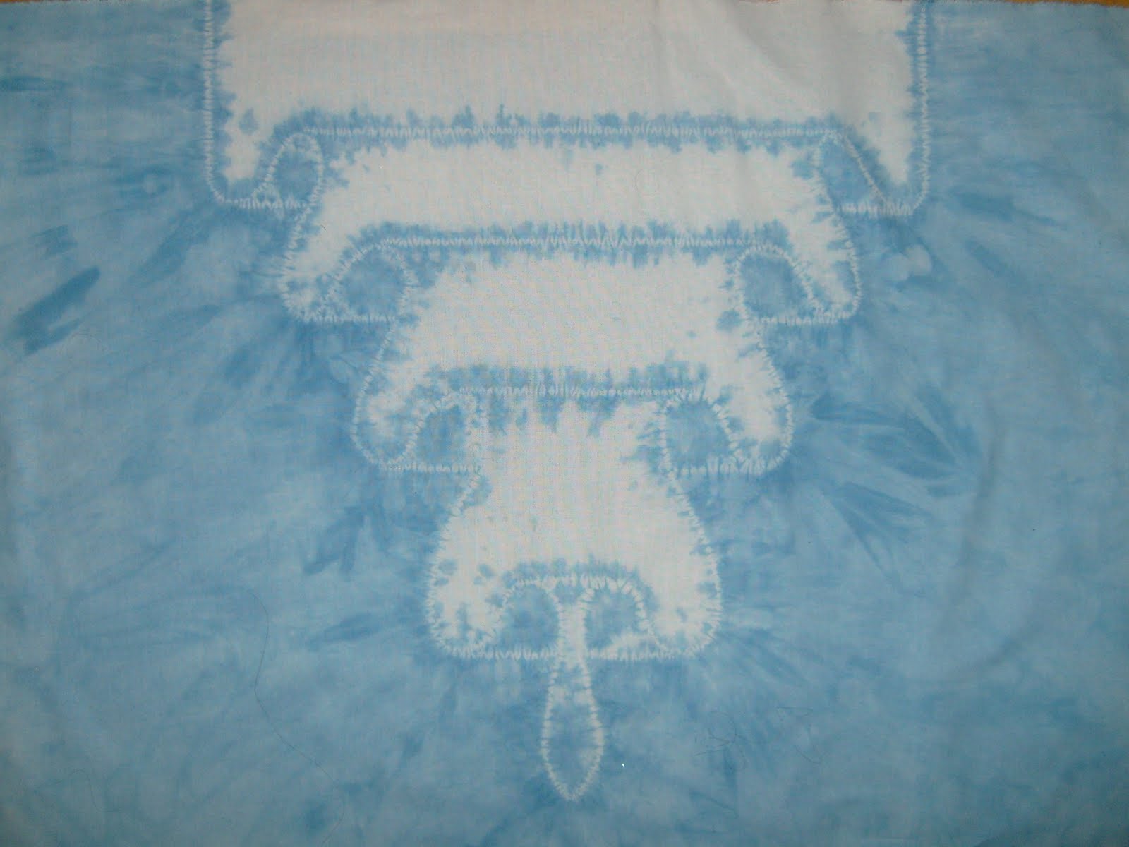
This is just a really simple design in that idea. Although I did it with soy wax batik rather than tying the knots. I used a tjanting, a little cup on a handle, to apply the wax by just touching it to the fabric. The size dot you get depends on how long you hold the tjanting in one spot as the wax flows out the spout and how hot the wax is. As it cools and thickens it doesn’t flow as fast.
The solid petals were filled in using the tjanting like coloring in with a pen. On the one in the upper left you can see the edges of some petals look like I started with dots and then filled in. Can’t imagine why they look like that…. So far, I prefer to use a brush to fill in the wax as I’m more used to it and the control I get. But this would be faster for larger areas as I have to dip the brush pretty frequently.
Like I said, I need more practice. I keep hoping I can learn magically and can be perfect on the first try but it hasn’t happened yet.
Friday, June 17, 2011
Petals
The petals of the flower are Maki-age; stitched around the outline, then pulled up tight and the thread wrapped around the point that sticks out. The straight lines are two rows of Maki-nui; straight rows of running stitches.
One of the things I learned is that when using thickened dye – at least at this consistency – I need to apply the dye to both sides of the fabric. It doesn’t soak through to the other side much. I use (no-needle) syringes to apply the dye. Using a squirt bottle seems too much like trying to get ketchup out of the bottle. And I can easily refill the syringe. The surplus store has an assortment of sizes.
I’m doing another practice piece similar to this, I want the petal shapes to be a bit different. These are nice, but the look I want it not so angular. Again, I need to apply the dye a bit further from the stitched line to get enough color to really show off the stitched part.
Thursday, June 16, 2011
Folds

For this one, I used dye thickened with sodium alginate because I didn’t want it spreading too much. But I need to put dye further from the stitch line so it shows up better.
The PVC cup was to try to keep the dye from getting on the part I wanted to stay white. I was concerned that it might get transferred to the other half by my hands or dye on the table. There is a technique called oke zome where the stitched fabric is placed in a bucket and a tight lid is place on so the fabric can be dunked in the dye vat. Indigo requires the item to be dunked in the dye vat several times to get a dark blue color. Since the indigo turns blue when exposed to the oxygen in the air, it doesn’t work well being painted on.
The little red pieces are bits of fabric I put between the knots and the fabric. It keeps the knots from showing up on the piece and makes it easier to find your knots when it’s time to take out the stitching.
I like how the finished piece turned out. I'll try again to get closer to what I have in mind.
Thursday, May 19, 2011
Tuesday, May 10, 2011
Red circles
The red one has more variation in color but the color is a bit darker so there was more room for shading from light to dark. I think the difference between the front and back is more pronounced also. The back looks like sediment kind of collected in the little poofs. The poofs on this one were pulled out a lot better. The insides of the circles look better than on the green one.


I need a lot more walls to hang things on. My office at work still has some room. I may have to start hanging them there.
Monday, April 25, 2011
Circular
One thing I noticed is that I didn't pull up the 'free' fabric well enough in the middle of the stitching in a couple of spots. The center and left side of the large design as well as left and upper of the small one. Even though those areas weren't stitched, because they were still compressed a bit they didn't get the dye as well as the areas I had pulled out properly.
Sunday, April 24, 2011
Zig-Zag
This was the first time I did stripes of dye. I thickened it with sodium alginate, which is seaweed, so it wouldn't bleed or drip. I mixed it about 1/2 teaspoon per cup of water so it was more like paint. Not nearly as this as the green dye in an earlier post. The alginate also seems to help it hold onto water better. It has to stay moist for the dye to react properly.
The lines and color bands are in a zig-zag because I folded the scarf in thirds before wrapping it around the pipe. I did 4 stripes, 2 blue and 2 purple. Using a larger diameter pipe, or doing only 2 stripes would make the color bands different.