It isn't a technique I invented, but I modified one I saw mentioned elsewhere. Someone had described snow dyeing where you scrunch up your soda ash soaked item, put a layer of snow on it, pour on the dye and wait for the snow to melt and the dye to color the fabric. The dye doesn't react with the fiber until it gets warm enough. And when it is all scrunched up the insides of the shirt don't get dye as fast as the outsides. So by the time the snow has all melted there isn't any dye left to color the inside. Except this doesn't work as well in the summer or if I don't feel like digging snow up out in my yard.
So instead of snow I freeze the shirts in my basement freezer. I've written up a step by step description of how I do it. Since I use the standup freezer in my basement I have quite a bit of room and can do several shirts at a time.
Some dye is highly likely to land on the table and/or floor so chose your location carefully. I work in the basement on a concrete floor near a floor drain. My basement isn’t really finished so it doesn’t matter to me. Plastic on the floor can be slippery so use with caution.
The instructions are for fiber reactive dye such as Procion MX. This isn’t for RIT or other all purpose dye.
· Dissolve soda ash in a bucket at one cup soda ash per gallon of water. Make sure to wear your dust mask when measuring out the soda ash. While it is pretty mild, it can’t be good to inhale the powder. The bucket needs to be large enough to fully submerse the shirt. If you’re doing more than one at a time they don’t need to all be in there at the same time but it makes it easier.
· Soak the item in soda ash for at least 10 minutes to make sure it is completely wet. It can be a day or more if that works better.
· Prepare a flat work surface. I use a plastic tray to protect my work table and contain any drips. (See
here for info)
· Squeeze out the excess water. You don’t need to really wring it out, but you don’t want it sopping wet. The more water left in it, the less dye that will get to the backside. Not a problem when doing fabric or a scarf since that is a single layer. But a t-shirt is 2 layers and the other side won’t have as much color. So it depends on the look you’re going for.
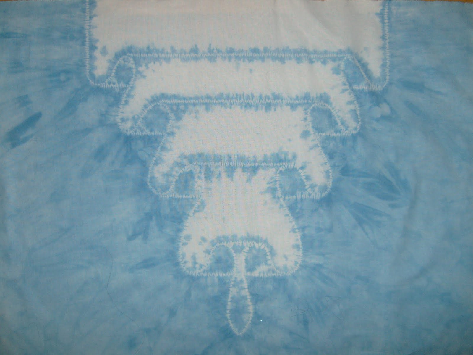
· Lay it out flat on your work surface then bunch it up. Try not to get parts folded under when bunching it up. You want to create high and low spots but not more layers. How tightly packed it is will affect how much dye gets into the fabric and to the back since the dye is applied to the tops of the ‘hills’ and won’t run down to the ‘valleys’ easily if it is tightly packed.
· I normally put the shirt into a one gallon bucket to keep it compact and to make it easy to handle. But for larger shirts I’ve used a plastic tray or plastic sheeting in a cardboard box. A larger plastic tray can hold more than one shirt or scarf at a time. 5 quart ice cream buckets would work well and have the added bonus of 'requiring' someone to eat the ice cream.
· Put the items in the freezer. If they’re only in there an hour or two they’ll have a different end pattern than if they’re in there for at least a day and are frozen solid. Since I’m in Minnesota I could put them out in the garage come January.
See here for a comparison
· For the dye, I mix it fairly strong since I want it to be a good contrast to the white of the fabric. Again, it depends on how you want it to look. I use two or three colors. They may intermix so choose colors that will blend nicely. I mix at one tablespoon dye powder to one quart water and can cover 4-6 shirts with this amount. Make sure to wear your dust mask and gloves when working with dye powder. Wet some newspaper and lay it on the table before mixing the powder. It will help capture powder and make it easily visible and cleanable. I don’t add urea or anything else. Only dye powder and warm water. If you want more info and hints on how to mix up the dye powder,
Dharma Trading has good detail.
· You can put the dye liquid into squirt bottles or measuring cups with spouts. Once you’ve used a cup or spoon for dye don't use it for food again. Use some cheapo or disposable cups and spoons. Check out Goodwill or the dollar store.
· Apply the colors in patches. You’ll have to experiment to see what you like best. I tend to cover the surface with dye. Usually, I use 2 colors in about equal amounts then add a third color in a smaller amount.
· Let sit for at least one day for it to thaw and react completely. The dye won’t react with the fabric until it gets up to room temp. If the area you’re storing the container in is colder, you’ll want to leave it for a couple days. It won’t hurt it any to leave it for several days until you’re ready to wash it out. The top might dry out a bit, but it won't hurt it if it does. And after a couple days it doesn’t really matter since all the dye that was going to react already has.
· Rinse well in cold water then wash by itself in warm or hot until the water is clear. Once the extra dye is thoroughly washed out it can be washed normally.