Wednesday, November 16, 2011

Pirate vs. Pirate

Sometimes, even when you use the same color dye it comes out differently. Both of these pirate shirts were dyed with black dye and were in one photo, I didn't modify the colors at all.

The one on the right has more of a purple cast to it. Black dye isn’t normally a ‘pure’ dye. It is made up of different colors of dye powder. So a weaker solution, or around the edges when tie-dyeing, won’t necessarily be gray. It might have a different color cast. Dharma describes the color cast each of their 4 black fiber reactive dyes has on the Description tab.

What can also happen is the color won’t be the same if the water used to dissolve the dye wasn’t warm enough. Some of the colors need hotter water to dissolve well. Fuchsia and turquoise both seem to dissolve better in warmer water. So some of one color’s particles might dissolve better than another color’s giving you something different than what you expected. That may not be a problem, it depends on what you want.

Tuesday, November 15, 2011

Fishing

When you go fishing you just know those large fish are down there.  Just taunting you from the deep.  But all you catch are the little ones.  So long as it is a nice day out and you don't get lost, right?

Tuesday, October 18, 2011

Schedule

This is the season for Craft Shows and Art Fairs.  And they are, thankfully, indoors since it is getting a bit chilly out.  My schedule is:

HandmadMN Fall Market 10am to 5pm Oct 22nd at the Ballentine VFW at the corner of Lyndale and Lake St in Minneapolis. 

St Philip's Holiday Market (they don't have a link just for the show) 9am to 3pm Nov 5th at St Philip's Church at 6180 Highway 65 NE, Fridley, MN.

Handmade Arts from the Heart  9am to 4pm Nov 12th at the Clara Barton Open School at 4237 Colfax Ave S, Minneapolis.

Women's Art Festival 10am to 5pm Dec 10th at the Midtown YWCA at 2121 East Lake St, Minneapolis.

Hope to see you at (at least) one of them.

Thursday, October 13, 2011

Bands

Bands only or all over? The contrast between the solid and pattern can make the pattern stand out more while the all over pattern can have a big impact. An example of Mokume Shibori, but only part of the shirt was stitched up for one.


Saturday, September 24, 2011

Canvas

Not too exciting, just a piece of canvas.  But it is pretty.  And interesting how the patten came out different on each side.  The orientation is the same in both photos. 

Just used the normal tray, swished it a few times and turned it over once or twice.  Since the canvas is so thick the dye doesn't soak through, it just sits on the surface.  It unravelled on the edges a bit while in the washer and the threads are still white on the side that was 'inside' of the weave.


It is going to become a tote bag for my display brackets.  Hmmm, I think the only other tote bag that doesn't have a logo of some sort on it is another one I made out of a lighter weight canvas I was testing.

Friday, September 16, 2011

Faded photos

This reminds me of old, faded sepia photos. Both the color and the variation of it. The technique is Katano Shibori. It is done by carefully fan or accordion folding the fabric, ironing it and stitching through all of the layers. Think of a sandwich and you spear it with a bunch of toothpicks. The stitching needs to be done from top to bottom one stitch at a time. You can’t do like you’re quilting it and trying to get a lot of stitches on the needle before pulling the thread through. I also needed to have the pattern marked on both sides so I could get the lines sewn properly. For me, it worked better to do some tacking at the corners and edges to keep the stack in place until I got some rows sewn.

When planning the layout you aren’t supposed to have any areas that are completely enclosed. The dye needs to enter the sandwich from the sides. The thickness of the stack won’t allow it to soak through all of the layers. And it needs to be swished around in the bucket more. Although mine are still kind of mottled because I like that better. Looks more hand dyed instead of factory printed. Depends on what look you prefer.

Both pieces are about 14” wide. I just kept folding them in half so I wouldn’t have short lengths of fabric left at the end since I didn’t want to cut and hem when I was done. By looking at just one of the sections you can tell how I stitched it. The set of three lines on the fold were where I wrapped the thread right on the fold. The scattered dots are single stitches.
The first one is a piece of cotton hemp cloth to practice and work out the technique. I didn’t put any waste or extra fabric on the top and bottom - like the bread for the sandwich – so the end got a lot more dye than the parts in the middle. Since it was a practice piece I didn’t feel like it. And I think it looks striking this way. It’s odd how much darker it is but the pattern of the lines is the same.
The second picture is a silk scarf and the cotton fabric to protect the ends. I think it is neat how color reactive dye will work on both cotton and silk, but be slightly different colors. These were done in chocolate brown. The silk is more rosy.

Again, the technique is well described in the book Shibori: The Inventive Art of Japanese Shaped Resist Dyeing by Yoshiko Iwamoto Wada.

I have got to figure out something useful to do with my practice pieces. I’ve done a few zippered bags, but how many does a person need? Especially lighter weight fabric or the silk hankies I like to practice on. And the design on some would look odd. Although I know I shouldn’t care since it is a practical item, I still want them to look right.

Friday, August 19, 2011

Leaves


A small practice piece trying out some different shapes and ways of stitching. This is some rayon made out of bamboo rather than the normal wood pulp or cotton. Although rayon is semi-synthetic, it dyes with the same dye that is used for cotton. It’s nice to work with and the fabric can be pulled up tightly so the marks are quite clear.

The leaf on the left was stitched around the outside and one row down the middle.

The center one was sewn in a set of arcs. You can see the dots along the top curves where the thread knots were. I didn’t use pieces of fabric to prevent like I frequently do.

The right hand one was 4 rows of arcs with the center left open.

Thursday, August 18, 2011

Folds


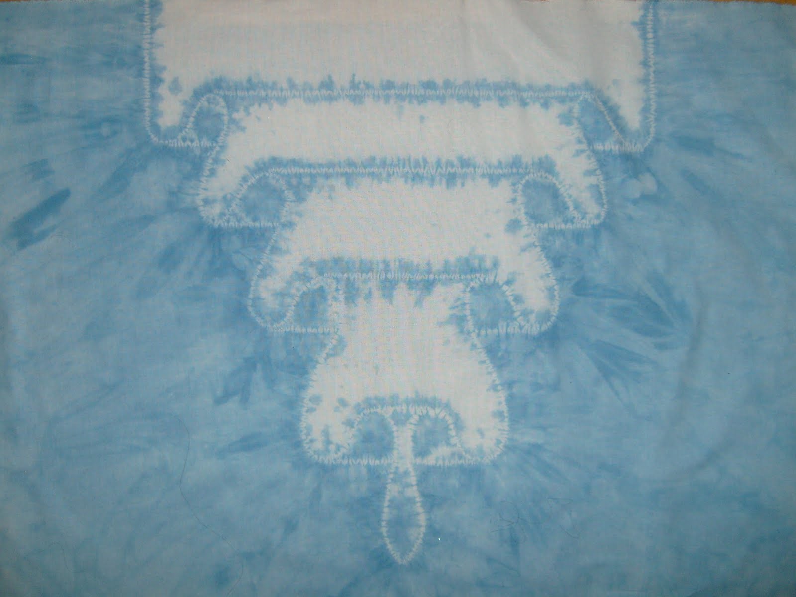
This is my second try at this design. The first one is here. When done well, it looks like a 2nd layer of fabric over the top. When I’m happy with how I figured out how to do it, I want to do a larger panel to use as a curtain. I didn’t make up the design. It is one I saw in the book Shibori: The Inventive Art of Japanese Shaped Resist Dyeing by Yoshiko Iwamoto Wada showing some of Nancy Marchant’s work. You have to figure out what happens when you do something to figure out how to work it so it looks like what you have in mind. I really recommend the book. It has very good instructions on how to do the techniques, as well as history and development.

The shape of the curves look more natural on this one. Although I dyed some spots I shouldn't. I need to mark where the dye needs to go. Perhaps some thread loops. Kind of like dye-by-number. I think I'll have the bottom different also. Not have the pointed part in the middle. Extend the undyed part to the bottom so it looks like the overlay goes all the way to the bottom.

Again, I used thickened dye to keep it from spreading. But I think I’ll need to put it up on a screen rather than flat on plastic so it doesn’t wick along on the plastic. I’ll probably do something like I use in my sink for rinsing out. I have to apply the dye to both sides since the thickener doesn’t allow it to soak through very well.

Friday, August 12, 2011

Better


In a previous post I commented that a piece I'd dyed was nice, but not quote what I wanted. This is the 2nd try and I like it a lot better. The shape of the petals is more what I was thinking and the dye application is better. In the first one I didn't put the dye far enough away from the stitched lines. The filling in between petals is nice because it gives a more dimensional look.
The petals are Maki-age, stitched outline, pulled up and wrapped with the ends of teh thread. The stem is Maki-nui, straigt rows of stitching and pulled up tight.
I think I mentioned before that it is a good thing you can get decent fabric to play with and practice on for pretty cheap. And think of all the entertianment time I got out of those small pieces of fabric.

Thursday, August 11, 2011

Dots


Well, I need a bit more practice. Some of the shibori designs are made up of (literally) millions of tiny dots such as in Kanoko. The grouping and spacing creates the image.
This is just a really simple design in that idea. Although I did it with soy wax batik rather than tying the knots. I used a tjanting, a little cup on a handle, to apply the wax by just touching it to the fabric. The size dot you get depends on how long you hold the tjanting in one spot as the wax flows out the spout and how hot the wax is. As it cools and thickens it doesn’t flow as fast.
The solid petals were filled in using the tjanting like coloring in with a pen. On the one in the upper left you can see the edges of some petals look like I started with dots and then filled in. Can’t imagine why they look like that…. So far, I prefer to use a brush to fill in the wax as I’m more used to it and the control I get. But this would be faster for larger areas as I have to dip the brush pretty frequently.
Like I said, I need more practice. I keep hoping I can learn magically and can be perfect on the first try but it hasn’t happened yet.