

Showing posts with label silk. Show all posts
Showing posts with label silk. Show all posts
Friday, July 24, 2015
Black and brown
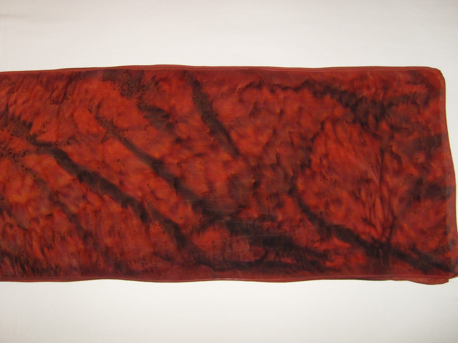
I'm not going to make a comment about shades of gray. Black is a tough color to dye. You have to use a lot of dye to get it dark, but it still frequently will not be pure black. The scarf is just two colors, black and brown. But because I clamped it so the dye couldn't get to part of it the dye separated some giving shades to it. And the brown looks almost metallic. Steam set dye on silk


Monday, February 23, 2015
Dots and dots
I've been playing with dots lately. How the silk is prepared makes a difference in the resulting pattern. Both scarves were stretched on a frame first and I used Jacquard Red Label steam set dye.
The nice, round dots are from when the silk is dampened evenly first. The dye spreads evenly into a circle. Since I didn't let the fabric and dye dry between colors the dots blend together.
The one with the irregular dots I treated with spray starch first and waited for it to dry. I let the dots dry between colors so they wouldn't blend. You can see how the dye wicked along the fibers in a much different way. It also has a more defined line around the outside of the dot. This is related to when you spill something on fabric you should wet it (depending on the fabric) so it doesn't have such a defined line.


The nice, round dots are from when the silk is dampened evenly first. The dye spreads evenly into a circle. Since I didn't let the fabric and dye dry between colors the dots blend together.
The one with the irregular dots I treated with spray starch first and waited for it to dry. I let the dots dry between colors so they wouldn't blend. You can see how the dye wicked along the fibers in a much different way. It also has a more defined line around the outside of the dot. This is related to when you spill something on fabric you should wet it (depending on the fabric) so it doesn't have such a defined line.
Sunday, February 8, 2015
Salt spots
This is a scarf that has the salt still on it. Before I remove it from the frame and steam it. You can really see how it makes the pattern. Sorry, I forgot to take a picture of it after it is steamed. This will be a really dark blue after steaming and washing out the extra dye.

Thursday, February 5, 2015
Blue salt
A scarf using salt to create the design. I've shown my frame in a previous post, but here is another example of the pattern that is produced by sprinkling rack salt on the wet dye. As the salt attracts the moisture, the color moves with it. And the blue looks so nice, very rich. It looks like it should have texture just from the color pattern. Since it is a steam set dye it is washable also.

Friday, August 23, 2013
Blue
Like the previous post, an example of color differences on cotton vs. silk and from previous batches.
The silk scarf on the right and the guy in the middle were in the same batch. The hooded tshirt, done with the Mokume Shibori technique, on the left is the same color but from a previous batch. I know the guy and scarf the dye was stronger. This is Dharma Trading's Lapis.

The silk scarf on the right and the guy in the middle were in the same batch. The hooded tshirt, done with the Mokume Shibori technique, on the left is the same color but from a previous batch. I know the guy and scarf the dye was stronger. This is Dharma Trading's Lapis.

Thursday, August 22, 2013
Green
Another example of the different color on silk and cotton. As well as in different batches.
The silk scarf on the right was in the same container, at the same time, as the flower shirt in the middle. Although fiber reactive dye will work on silk, the colors shift a bit so it will be different. The tiger on the left was dyed with the same color, forest green from Dharma Trading, but in a different batch. It shows that there are differences from batch to batch.
There are several possibilities: I may have mixed it with hotter or cooler water, it may have been a different strength, the water hardness at the new house might have made a difference, the moon wasn't full.

The silk scarf on the right was in the same container, at the same time, as the flower shirt in the middle. Although fiber reactive dye will work on silk, the colors shift a bit so it will be different. The tiger on the left was dyed with the same color, forest green from Dharma Trading, but in a different batch. It shows that there are differences from batch to batch.
There are several possibilities: I may have mixed it with hotter or cooler water, it may have been a different strength, the water hardness at the new house might have made a difference, the moon wasn't full.

Thursday, December 13, 2012
Bronze
I'm really happy with how this turned out. The colors work really well together. The chocolate brown really looks like metallic bronze with the luster of the silk Crepe de Chine.
It is Jacquard red label black and chocolate brown dye. Folded and clamped in the Itajime Shibori style. I only wet it a little bit before applying the dye so it wicked in to the middle more than some. That is what allows the slight white section between the brown and black.
Another one I want to keep for myself. All I need now is more places to wear them.

It is Jacquard red label black and chocolate brown dye. Folded and clamped in the Itajime Shibori style. I only wet it a little bit before applying the dye so it wicked in to the middle more than some. That is what allows the slight white section between the brown and black.
Another one I want to keep for myself. All I need now is more places to wear them.

Thursday, December 6, 2012
Lines
These pictures are all of the same silk scarf, but at different steps.
First, I stretched it on the frame and painted it with red dye. Then I painted some free form lines with black. You can see in the first picture how defined the lines are.


And the scarf after steam setting the dye and washing it. I'm really happy how this turned out. Red dye doesn't move much with the salt, but the black does.

First, I stretched it on the frame and painted it with red dye. Then I painted some free form lines with black. You can see in the first picture how defined the lines are.

The second picture shows how diffuse the lines became with the salt pulling the dye.

And the scarf after steam setting the dye and washing it. I'm really happy how this turned out. Red dye doesn't move much with the salt, but the black does.
Sunday, December 2, 2012
Folds
I tried out a different way to fold this scarf before wrapping it around the pole Arashi style. I hope the pictures make it clear, it's a bit awkward to describe.
I folded it in half the long way, than overlapping folds facing the same way to shorten it up. The first picture is when it was folded and ironed. The second one is when I was trying to get it to stay on the pole long enough to wrap it with string. That was the biggest challenge. And, of course, the finished product in the third picture partially folded like it was when I dyed it.


Wednesday, November 28, 2012
Amber waves
A new color from Dharma Trading, Amber Waves. Similar to Palamino gold but with just a little more orange tint to it, a little warmer. I know I could mix my own colors, but I'm not as interested in that as the designs on the fabric.
This is a silk scarf that was folded in thirds the long way then wrapped Arashi style on the pole.

This is a silk scarf that was folded in thirds the long way then wrapped Arashi style on the pole.

Tuesday, October 23, 2012
Purple
I like purple, can you tell?
These three are Itijime Shibori, where they're folded and clamped between shapes. Kind of like folding paper for cutting out snowflakes in art class in school. All three were in the same batch of dye.

The one on the left is silk crepe de chine. The middle is a soft, slightly looser weave of rayon. The one on the right is a hand woven (not by me) rayon with subtle stripe in the weave.
And again, you can see how the color shifts on silk compared to rayon.
These three are Itijime Shibori, where they're folded and clamped between shapes. Kind of like folding paper for cutting out snowflakes in art class in school. All three were in the same batch of dye.

The one on the left is silk crepe de chine. The middle is a soft, slightly looser weave of rayon. The one on the right is a hand woven (not by me) rayon with subtle stripe in the weave.
And again, you can see how the color shifts on silk compared to rayon.
Friday, October 19, 2012
Burgundy
These were wrapped the same and in the same dye bath. The one on the right is a soft, looser weave, rayon scarf. It compresses more so has wider stripes of white. The one on the left is silk crepe de chine, which doesn't compress as much so the amount of white is smaller. And the color is a bit different because one is silk and one rayon.

Monday, October 8, 2012
Circles and squares

Saturday, October 6, 2012
Lavender
Another example of the different color cotton and silk give even when they're in the same container. This is lavender dye. The tshirt is a soft 100% cotton and the scarf is 100% silk Crepe de Chine. The silk seems a lot more blue. Other times when I put silk in blue dye it seems more purple.


Saturday, February 18, 2012
Crackles
Yes, some more silk hankies. I told you I've done a lot of hankies. They're a lot smaller, cheaper and easier to deal with than scarves. I could cut a scarf into pieces, but it is nice to not have to deal with the edges raveling.
The one on the left was completely covered with wax then scrunched to get the wax to crackle. Soy wax doesn't crack as much as paraffin, but it will crack. I didn't start out to see what it would look like. But the test design I was trying to do was rather blobby and unattractive. So I figured it was a good opportunity to see how it would turn out if I completely coated it on both sides.
 The one on the right is to show what color the dye was. Even though it was in a blue dye bath, the coated one turned out with a lot of purple. A more extreme example of the color shift of fiber reactive dye on silk. It is beautiful, but would be an awful lot of wax on one scarf. I'll try doing some smaller circles on a scarf like this and see how it turns out. Since the soy wax is degraded by the soda ash used in a dye bath the wax tends to wear off more on a larger item that needs to be stirred more. But it should still look really interesting.
The one on the left was completely covered with wax then scrunched to get the wax to crackle. Soy wax doesn't crack as much as paraffin, but it will crack. I didn't start out to see what it would look like. But the test design I was trying to do was rather blobby and unattractive. So I figured it was a good opportunity to see how it would turn out if I completely coated it on both sides.

Friday, February 17, 2012
Crane
Another stencil I cut. This one is a bit smaller and is a stand alone motif of a crane used as a Kamon.
In Japan, Kamon were used in a similar manner as coats of arms. A person, family, organization or company would use it as their insignia or symbol.
They're less ornate than most coats of arms and don't have so many elements combined into them. They typically are cohesive and streamlined. It doesn't combine different branches of the family. To me, it is more of a stand alone emblem rather than an ancestor reference. So I find Kamon attractive for batik work. Some are more bold than others and a lot of them are stylized.
Another sample done on a hankie to see how the design works. I've got quite a selection of silk hankies that I've done for practice. I'm taking a class at the Textile Center next month that uses scraps of fabric bonded to card stock and folded into origami boxes. I figure these would work well for that. Then I just need to find someone to give little boxes to. Hmm. I took a class on making fabric Kazashi flowers earlier this month. The hankie wouldn't work as well for that since they need more pieces of fabric. Or at least larger pieces than I can get to fold. My fingers aren't as agile as they would need to be for that.

In Japan, Kamon were used in a similar manner as coats of arms. A person, family, organization or company would use it as their insignia or symbol.
They're less ornate than most coats of arms and don't have so many elements combined into them. They typically are cohesive and streamlined. It doesn't combine different branches of the family. To me, it is more of a stand alone emblem rather than an ancestor reference. So I find Kamon attractive for batik work. Some are more bold than others and a lot of them are stylized.
Another sample done on a hankie to see how the design works. I've got quite a selection of silk hankies that I've done for practice. I'm taking a class at the Textile Center next month that uses scraps of fabric bonded to card stock and folded into origami boxes. I figure these would work well for that. Then I just need to find someone to give little boxes to. Hmm. I took a class on making fabric Kazashi flowers earlier this month. The hankie wouldn't work as well for that since they need more pieces of fabric. Or at least larger pieces than I can get to fold. My fingers aren't as agile as they would need to be for that.

Thursday, February 16, 2012
Quality time with my XActo knife
Since my studio is in the basement, and it is still winter in Minnesota, I haven't been working there much. It is a bit chilly and the batik wax sets up too fast. Makes it so things don't turn out the way I like. So I've been doing some work down there, but not a lot.
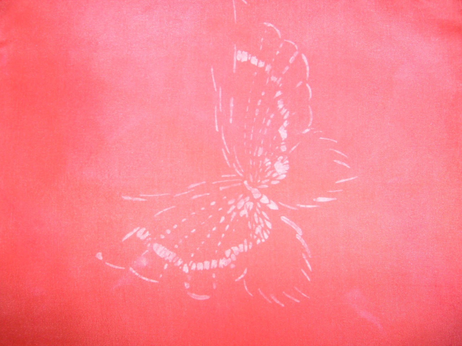
But I have been cutting some stencils. We'll see how they work. The butterfly one is more intricate and with the wax setting up faster it doesn't work as well. But once it gets a bit warmer, I'll give the full repeat a try. It is an adaptation of an old Japanese Katagami (stencil) with impressions of grasses blowing in the wind. So I'm interested to see how it will turn out. Especially since I spent a lot of time cutting it out. The overall design is rather large. This is a 12"x12" hankie.

But I have been cutting some stencils. We'll see how they work. The butterfly one is more intricate and with the wax setting up faster it doesn't work as well. But once it gets a bit warmer, I'll give the full repeat a try. It is an adaptation of an old Japanese Katagami (stencil) with impressions of grasses blowing in the wind. So I'm interested to see how it will turn out. Especially since I spent a lot of time cutting it out. The overall design is rather large. This is a 12"x12" hankie.
Thursday, December 8, 2011
Wine
Another scarf where the dye didn't move the way I expected. Although this one was wetter than normal since the dye wasn't wicking across the scarf the way I wanted so I misted it with a bit more water.
The edge isn't blurry because of the photo, that is the way the pattern worked out. It really gives it nice visual texture with the contrast of the sharpness and the diffuseness.
It looks like a nice wine, to go with the chocolate one I posted yesterday.


The edge isn't blurry because of the photo, that is the way the pattern worked out. It really gives it nice visual texture with the contrast of the sharpness and the diffuseness.
It looks like a nice wine, to go with the chocolate one I posted yesterday.


Wednesday, December 7, 2011
Chocolate
I really like the pattern that resulted on this silk scarf. I stretched it on the frame, painted on the dye and sprinkled rock salt all over. Salt attracts moisture and so the color can move along with the water it is dissolved in. The more dye collected in one spot, the darker it is. But different colors of dye react in a variety of ways. Blue moves a lot more than red, for example.
It also makes a difference how wet the scarf is or how large the salt crystals are. If the salt just dissolves then it won't pull the dye around.
The chocolate brown dye I used for this one didn't move in the same way as the blue one in the post here. It did give a really neat texture though. Kind of like miniature leopard spots. It looks like it should have a pebbly texture, but doesn't.
See, chemistry matters. And is fun.


It also makes a difference how wet the scarf is or how large the salt crystals are. If the salt just dissolves then it won't pull the dye around.
The chocolate brown dye I used for this one didn't move in the same way as the blue one in the post here. It did give a really neat texture though. Kind of like miniature leopard spots. It looks like it should have a pebbly texture, but doesn't.
See, chemistry matters. And is fun.


Friday, September 16, 2011
Faded photos
This reminds me of old, faded sepia photos. Both the color and the variation of it. The technique is Katano Shibori. It is done by carefully fan or accordion folding the fabric, ironing it and stitching through all of the layers. Think of a sandwich and you spear it with a bunch of toothpicks. The stitching needs to be done from top to bottom one stitch at a time. You can’t do like you’re quilting it and trying to get a lot of stitches on the needle before pulling the thread through. I also needed to have the pattern marked on both sides so I could get the lines sewn properly. For me, it worked better to do some tacking at the corners and edges to keep the stack in place until I got some rows sewn.
When planning the layout you aren’t supposed to have any areas that are completely enclosed. The dye needs to enter the sandwich from the sides. The thickness of the stack won’t allow it to soak through all of the layers. And it needs to be swished around in the bucket more. Although mine are still kind of mottled because I like that better. Looks more hand dyed instead of factory printed. Depends on what look you prefer.
Both pieces are about 14” wide. I just kept folding them in half so I wouldn’t have short lengths of fabric left at the end since I didn’t want to cut and hem when I was done. By looking at just one of the sections you can tell how I stitched it. The set of three lines on the fold were where I wrapped the thread right on the fold. The scattered dots are single stitches.
 The first one is a piece of cotton hemp cloth to practice and work out the technique. I didn’t put any waste or extra fabric on the top and bottom - like the bread for the sandwich – so the end got a lot more dye than the parts in the middle. Since it was a practice piece I didn’t feel like it. And I think it looks striking this way. It’s odd how much darker it is but the pattern of the lines is the same.
 The second picture is a silk scarf and the cotton fabric to protect the ends. I think it is neat how color reactive dye will work on both cotton and silk, but be slightly different colors. These were done in chocolate brown. The silk is more rosy.
Again, the technique is well described in the book Shibori: The Inventive Art of Japanese Shaped Resist Dyeing by Yoshiko Iwamoto Wada.
I have got to figure out something useful to do with my practice pieces. I’ve done a few zippered bags, but how many does a person need? Especially lighter weight fabric or the silk hankies I like to practice on. And the design on some would look odd. Although I know I shouldn’t care since it is a practical item, I still want them to look right.
When planning the layout you aren’t supposed to have any areas that are completely enclosed. The dye needs to enter the sandwich from the sides. The thickness of the stack won’t allow it to soak through all of the layers. And it needs to be swished around in the bucket more. Although mine are still kind of mottled because I like that better. Looks more hand dyed instead of factory printed. Depends on what look you prefer.
Both pieces are about 14” wide. I just kept folding them in half so I wouldn’t have short lengths of fabric left at the end since I didn’t want to cut and hem when I was done. By looking at just one of the sections you can tell how I stitched it. The set of three lines on the fold were where I wrapped the thread right on the fold. The scattered dots are single stitches.


Again, the technique is well described in the book Shibori: The Inventive Art of Japanese Shaped Resist Dyeing by Yoshiko Iwamoto Wada.
I have got to figure out something useful to do with my practice pieces. I’ve done a few zippered bags, but how many does a person need? Especially lighter weight fabric or the silk hankies I like to practice on. And the design on some would look odd. Although I know I shouldn’t care since it is a practical item, I still want them to look right.
Subscribe to:
Posts (Atom)